
Colours & themes
Every colour on a Gantt chart comes from one of two places: the task’s own stored colour, or the project’s colour theme. Knowing which is which is the whole trick — it explains why one bar stubbornly keeps its old colour when you switch themes.
Gantt Excel colours a chart in layers. Underneath sits the theme — one palette of 32 colours covering bars, timeline headers, borders, priority, status and the critical path. On top of it sit the colours you set on individual tasks, which override the theme for that one row and keep overriding it forever. This page covers both, and the rule that decides which wins.
01 Where a colour comes from
When Gantt Excel draws a task bar it asks a short question: does this row have a colour of its own? If the row’s colour cell is filled, that colour is used. If it is empty, the bar takes the project’s current theme colour instead.
That is the whole hierarchy, and it has one consequence worth burning into memory:
Four colours can be stored per task: the Estimated bar, the progress shading, the Baseline bar and the Actual bar. Everything else on the chart — timeline headers, grid borders, the project row, priority cells, the critical path — is theme-only and is set once for the whole project.
02 Colouring a single task
There are two ways to give one task its own colours, and they write to the same four cells.
From the chart. Click a task’s Estimated bar. Two small markers appear just past the right-hand end of the bar — click the round one and the Gantt Bar Colors dialog opens for that row. It holds four swatches: Estimated, Percentage Complete, Baseline and Actual. Click a swatch, pick a colour, and the bar recolours straight away — there is no OK button, just Cancel to close.
From the Task Form. Double-click the task row and look for Bar Colors near the bottom of the form. The same four swatches are there — labelled Estimated, Percentage Color, Baseline and Actual — plus a Reset button. Changes here only stick when you click OK.
Worked example — making one task impossible to miss
In the kitchen refit, “Order worktops” runs Mon 6 July → Fri 24 July, 15 working days on a Monday–Friday week, because the supplier’s lead time is 3 weeks. It is the one task everybody keeps asking about, so colour its Estimated bar a hot orange: double-click the row, click the Estimated swatch under Bar Colors, pick the orange, click OK.
From then on that bar is orange in every screenshot of the plan — and it stays orange when you switch the project from Blue to Dark a month later, because the colour is stored on the task row rather than in the theme.
The Reset button on the Task Form does the same thing for all four at once — it puts every swatch back to the project’s current colours, so the row rejoins the theme. Use it when a task has picked up colours you no longer want and you can’t remember which of the four you changed.

One view-dependent detail, and it really is the view rather than the chart: in Hourly View the progress shading is drawn as its own overlay on top of the bar, while in every other view it is a gradient baked into the bar itself. The same hourly chart looked at in a daily view therefore behaves like the daily case. The swatch is the same either way — Gantt Excel works out which shape to repaint. Views are covered in the Views, timeline & zoom guide and hourly charts in the Planning by the hour guide.
03 The project’s own colours
Everything that isn’t a single task’s colour lives in Gantt Excel → Settings → Settings, on the Display tab, under Customize Gantt Chart. A theme carries 32 colours in all, though not all 32 are on screen at once — the view decides which swatches are shown, as the note under the table explains. Click a swatch, pick a colour, and the chart repaints immediately — there is no separate Apply step for colours.
There is a prerequisite, though, and it catches everyone once: the swatches only accept a change while the theme is set to Custom. On any other theme a click is refused with a message. Only Custom can be edited, further down, explains why and how to work with it.
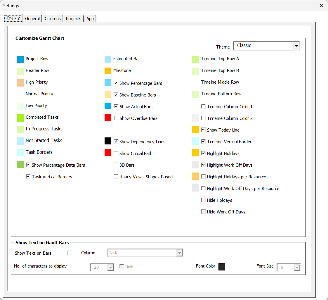
- Theme. The dropdown at the top that swaps all 32 colours in one go.
- Bar colours. Estimated, Milestone, Baseline, Actual and Overdue bars.
- Timeline rows. The three header tiers, named by position rather than content.
- Rows and borders. Project Row, Header Row and Task Borders.
- Critical path. The outline colour used for critical bars and critical links.
- Priority and status. Six swatches that colour the grid rather than the bars.
The ones you are most likely to reach for:
| Swatch | What it colours |
|---|---|
| Estimated Bar | The main task bar — the default for every task that has no colour of its own. |
| Milestone | The diamond marker drawn for a zero-duration task. |
| Project Row | The banner row at the top of the sheet carrying the project name. |
| Header Row | The column-heading row above the task list. |
| Task Borders | The grid lines around the task rows. |
| Timeline Top Row A / Timeline Top Row B | The two alternating colours of the top timeline tier. |
| Timeline Middle Row / Timeline Bottom Row | The second and third timeline header tiers. |
| Timeline Column Color 1 / Timeline Column Color 2 | The alternating shading down the timeline columns — each is a tickbox with its own swatch beside it. |
| Base Bar (Hourly View) | The full-cell background bar drawn behind hourly tasks. Only on screen in Hourly View — see below. |
04 Priority and status colours
Six of the swatches colour the task grid rather than the chart, and they behave differently enough to be worth their own section.
High Priority, Normal Priority and Low Priority fill the Priority cell itself, with grey text drawn on top. A task with no priority set is skipped, so its cell stays plain.
Completed Tasks, In Progress Tasks and Not Started Tasks paint the narrow status stripe at the left edge of each task row. Here is the part that surprises people: the stripe is driven by % Complete, not by the Status dropdown.
So “Fit kitchen units” at 40% shows the In Progress colour on its stripe even if you left the Status dropdown reading Not Started. If a stripe looks wrong, check the percentage first. The two fields are explained side by side in the Priority, status & task colours guide and the % Complete guide.
05 The critical path colour
The critical path has its own swatch, and it draws an outline rather than a fill: critical task bars get a coloured border, and a dependency line between two critical tasks is drawn in that colour instead of the normal connector colour. The bar keeps whatever fill it already had, so a task can be both orange and critical.
Change the critical path colour and the outlines repaint on the spot — including when you switch themes, which carries a critical path colour of its own.
06 Colour themes
A theme is a stored palette: one saved set of all 32 colours. Pick one from the Theme dropdown at the top of the Display tab and the whole chart repaints — bars, timeline, borders, priority, status and the critical path — in a second or two.
Underneath, the project keeps its palettes and its live colours in separate places, and that separation is what makes themes behave the way they do:
“What does each theme look like?”
One saved row per theme, never drawn from. They sit there so a theme can be re-applied later, and so your own Custom palette survives you wandering off to another theme and back.
Changing a stored palette by hand does nothing to the chart. Nothing is ever drawn from it directly.
“What is the chart being painted with right now?”
A single row of live colours. Every drawing routine in Gantt Excel reads this and only this.
Choosing a theme copies its stored palette into the live row. That copy is the entire act of applying a theme — which is why the change is immediate and why nothing needs saving.
Once you know that, two otherwise-odd behaviours become obvious. A theme change is instant because it is a copy, not a recalculation. And a per-task colour survives it because per-task colours live on the task row, which a theme never touches.
The dropdown offers five themes: Blue, Classic, Excel, Dark and Custom. The Excel one gives a chart the restrained, neutral look of a plain spreadsheet — greys and soft fills rather than the stronger colours of the others.

07 Only Custom can be edited
Click any colour swatch while Blue, Classic, Dark or Excel is selected and Gantt Excel stops you with:
Set the theme to CUSTOM to change this color.
This is deliberate. The four supplied themes are meant to stay as shipped, so that switching back to one always gives you a known starting point. Custom is the one that is yours to change.
Open Gantt Excel → Settings → Settings and go to the Display tab.
Set Theme to Custom. The chart repaints in whatever the Custom palette currently holds.
Click any swatch and pick a colour. The chart updates as you go — one swatch at a time, no Apply button.
Every colour you change on Custom is written twice — once into the live colours, so the chart repaints, and once into the stored Custom palette, so it is still there when you come back. That is why you can try Dark for a week, return to Custom, and find your own scheme exactly as you left it.
08 Common questions
I changed the theme but one bar kept its old colour. Why?
Why can’t I click the colour swatches in Settings?
Can I edit the Blue or Dark theme so it stays changed?
My status stripe says In Progress but the Status dropdown says Not Started.
Clicking a bar doesn’t bring up the colour marker.
Do colours print and export the way they look on screen?
Related: Settings · Priority, status & task colours · The Critical Path & float · The Task Form