
The Web Report
The Web Report turns your plan into a single HTML file you can email to anyone — a client, a contractor, your board. They open it in a browser, with no Excel and no Gantt Excel installed, and it still works years later with no internet connection.
The Project Dashboard answers “how is the project doing?” for you, inside Excel. The Web Report answers the same question for someone else. It is a status report — headline progress, what is late, what is coming, the numbers behind it — written to one file that carries everything it needs inside itself.
01 Exporting a report
Start on the Gantt chart you want to report on — the export always reads from the chart sheet you are standing on. Then:
Go to Gantt Excel → Gantt Charts → Dashboard. This one is a menu, not a button — clicking it drops open two items.
Choose Web Report (HTML)…. (The other item, Project Dashboard, builds the in-Excel dashboard instead.)
The Export Web Report dialog asks how much to include — see section 03 — then click Export.
Gantt Excel shows Building report…
while it refreshes the underlying data, then writes the file and opens it in your default browser.
If you are not on a chart sheet when you start, nothing is exported and you are told why: Select a Gantt chart worksheet before exporting a report.

02 What’s in the report
The report is a full status pack, built in the order a reader wants it: the headline first, the detail last. Sections that have nothing to say are left out entirely rather than printed empty, so a simple plan produces a short report.
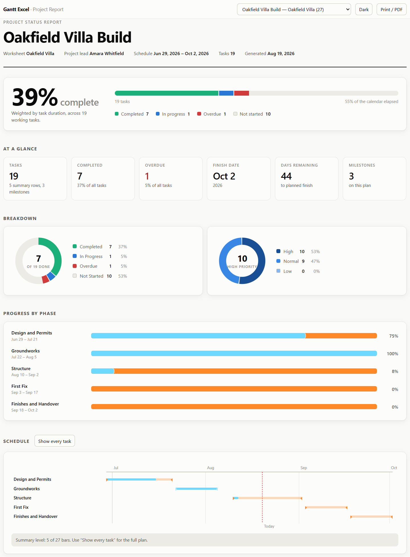
- Project picker. A dropdown at the top, shown only when the file holds more than one project.
- Dark and Print / PDF. Two buttons that never appear on the printed page.
- Title block. Project name, worksheet, project lead, schedule dates, task count and the date it was generated.
- Headline percentage. Overall progress, weighted by task duration.
- Status meter. Completed, in progress and overdue drawn as one bar, with counts underneath.
- At a glance. Six tiles — tasks, completed, overdue, finish date, days remaining, and either estimated cost or, on a plan carrying no costs, the milestone count. The Tasks tile counts the work in your plan: summary rows and milestones are not tasks, so they are counted separately and named underneath it. The days tile turns into Days overdue once the planned finish has gone by, and a seventh tile, Critical tasks, appears when the critical path is switched on.
- Breakdown donuts. Status always; priority as well when more than one priority is in use.
- Progress by phase. One progress bar per top-level summary task — shown only when the plan has more than one of them, since a single phase would just repeat the headline figure.
- Schedule. The Gantt chart itself, drawn in the same bar colours as your sheet. It opens collapsed to summary rows — see below.
The schedule opens collapsed
Worth knowing before you wonder where your tasks went: the Schedule section draws summary rows only to start with — one bar per parent task. A 40-task kitchen refit built under six phase headings opens with six bars, and a line under the chart saying how many of the whole plan that is.
The button beside the Schedule heading switches it: Show every task draws the full plan, Summary rows only folds it back. It starts collapsed because a phase-level chart is what a client actually reads — and the button only appears at all when your plan has summary rows to collapse to, so a flat list of tasks always shows every bar. The timeline underneath does not move when you switch, so a bar sits at the same date either way.
Below the schedule the report keeps going:
- Critical path — the chain in order, earliest first, plus the tasks closest to joining it. Only produced when Show Critical Path is switched on for that chart; see The Critical Path & float.
- Progress curve — the cumulative share of planned work due to finish by each date. When the plan has baseline dates, the baseline is drawn as a dashed second line, so the gap between the two is your schedule drift.
- Needs attention — the eight most overdue tasks, worst first, with how many days past their finish date they are.
- Resource load — how much work each of the twelve busiest people is carrying, heaviest first, in days (or hours on an hourly chart). Shown when anyone is assigned.
- Cost — Estimated, Baseline, Actual and the variance between actual and estimate. Shown only when the plan carries costs.
- Milestones — every milestone with its date and status.
- Task detail — the full table: WBS, task, start, finish, duration, resource, progress and status, plus a Float column when the critical path is switched on for that chart.
03 One project, or the whole workbook
The Export Web Report dialog offers exactly two choices:
“This project only”
Exports the chart you are standing on and nothing else. This is the option that is already selected when the dialog opens, and it is the one to use for anything you are sending outside your own team.
“All projects in this workbook”
Exports every Gantt chart in the file into one report, with a dropdown at the top for switching between them. Useful for a portfolio review — risky for anything else.
04 Where the file goes
On Windows you are not asked. The report is written straight to your temporary folder and opened in your browser, named after the project and the day, like Kitchen Refit Report 2026-08-11.html.
On Mac you are asked for a folder first, because sandboxed Excel cannot write and open a file behind your back. Pick where the report should live and it is saved there. If macOS then refuses to open it for you, Gantt Excel tells you where it is instead of failing quietly: The report was saved but could not be opened automatically. Open this file in your browser:
followed by the path.
If the file cannot be written at all — a read-only folder, usually — you get The report could not be saved. Check that you have permission to write to that folder and try again.
One file, no strings attached
Everything the report needs is inside it: the data, the layout and the charts, which are drawn on the page rather than fetched as images. It loads nothing from the internet, so it works on a plane, behind a corporate firewall, or opened from a memory stick in five years’ time. Nothing is sent anywhere when the reader opens it.
Two buttons sit at the top of the report itself, and neither is part of the document:
- Dark flips the report to a dark theme, and back again with Light. Which of the two it opens in is not your choice or the reader’s — the report follows whatever their own computer is set to, so a client on a dark-mode laptop sees a dark report the moment they double-click your file. Nothing is missing or different in it; only the colours change.
- Print / PDF opens the browser’s print dialog. Choose “Save as PDF” as the printer and you have a PDF of the report. The toolbar, the project picker and the schedule toggle are all dropped from the printed version, and sections are kept from splitting across a page break.
That is the difference between this and Export to PDF: the PDF export prints the sheet, while the Web Report is a designed status report that happens to print well.

05 How the report works out each status
This is the one thing about the Web Report that surprises people, so it is worth being blunt about it. The Completed · In Progress · Overdue · Not Started pills in the report are not the Status you chose on the Task Form. They are worked out fresh at export time, from two fields only — % Complete and the Estimated End Date — in this order:
Read it top to bottom and stop at the first match. A task that is 100% complete is Completed even if its end date was last month — finished is finished. A task that is not finished and whose end date has gone by is Overdue whatever progress it has. Only then does any progress at all make it In Progress.
The Priority shown in the report is the one you set — High, Normal or Low, exactly as on the sheet. Status is the derived one.
Worked example — the kitchen refit on 11 August
Four tasks, reported on Tuesday 11 August:
| Task | Estimated end | % Complete | Reported as |
|---|---|---|---|
| Strip out old kitchen | Fri 24 July | 100% | Completed |
| First-fix plumbing | Fri 8 August | 60% | Overdue |
| Fit kitchen units | Fri 21 August | 25% | In Progress |
| Tile splashback | Fri 28 August | 0% | Not Started |
Nobody typed “Overdue” anywhere. First-fix plumbing earned it by being unfinished on 11 August with a finish date of 8 August, and it will appear in Needs attention as 3 days late — counted in calendar days, not working ones. Tomorrow the same task reports as 4 days late, from the same workbook, with nothing edited.
Overall progress is weighted by task duration, so a 20-day task counts twenty times as much as a 1-day one, and summary rows are excluded so no work is counted twice. It is the same calculation the in-Excel dashboard uses, so the two can never disagree — the details are in Understanding % Complete.
06 Using your own report template
Everything about how the report looks lives in an HTML template, and Gantt Excel lets you replace it with your own — your brand, your colours, your section order, your logo. Find it in the Settings window, under Web Report Template:
Click Load Template… and pick your .html file. Gantt Excel checks it before storing it.
The label beside the buttons changes from Built-in template to your file’s name and the date you loaded it. Every export from then on uses it.
Changed your mind? Reset to Default throws the loaded template away and goes back to the built-in one — The report template has been reset to the built-in one.
The button is greyed out while there is nothing to reset.
What makes a valid template
A template is an ordinary HTML page with one required marker in it. Gantt Excel refuses anything that would produce a broken report, and tells you which rule it broke:
| Rule | What you see if it is broken |
|---|---|
| Must contain the __REPORT_DATA__ marker, which is where your project data is substituted in | This file is not a Gantt Excel report template. A template must contain the __REPORT_DATA__ marker. |
| Plain ASCII characters only | This template contains characters that cannot be saved correctly. Report templates must use plain ASCII text only. |
| 600 KB at most | This template is too large. The maximum size is 600 KB. |
| The file must be readable | This file could not be read. It may have been moved, renamed, or deleted. |
The ASCII rule is the one that catches people out. Accented letters, curly quotes, em dashes and emoji in the template will be rejected — write them as HTML entities instead. It applies only to the template you load, never to your project data: task names, resource names and notes can be in any language and any script, and come through the report intact.

07 Common questions
Does the person I send it to need Excel, or Gantt Excel?
Why does a task show as Overdue when I set its status to In Progress?
The critical path section isn’t in my report.
Can I send one file covering several projects?
Where did my report go? It opened and I closed the tab.
Can I get this as a PDF?
Related: The Project Dashboard · Exporting & printing · Understanding % Complete · Settings