
The Gantt Excel tab & your chart sheet
Everything Gantt Excel can do lives in three places: one ribbon tab, one worksheet laid out as a task grid, and the right-click menu on that grid. This page is the tour: where each control is, what it is called, and why some of them are greyed out.
A Gantt Excel chart is an ordinary Excel worksheet with a great deal of machinery behind it. The left-hand side is a task grid you type into; the right-hand side is the timeline where the bars are drawn. Driving all of it is a single ribbon tab called Gantt Excel, which appears to the left of Home as soon as the workbook opens.
01 The Gantt Excel tab
The tab sits before the Home tab, so it is the first thing on the ribbon. Press Alt then G to jump straight to it from the keyboard. That shortcut and every other one in the product is listed in Keyboard shortcuts.
Throughout these guides a ribbon path is written as Gantt Excel → Section → Button. So the way to add a task is Gantt Excel → Tasks → Add Task.
02 What is on the ribbon
Ten sections, left to right. Here is the whole tab at once, on an hourly chart:

That is a lot to read at ribbon size, so the same tab is broken into three below. Hover or tap a numbered pin to see what each part is for; the key under each strip says the same thing in full.

- The chart itself. Add New Gantt Chart builds a fresh chart sheet; Edit Project opens the project name, lead and budget figures that sit above the grid.
- Reports. Dashboard is a small menu holding Project Dashboard and Web Report (HTML)…. See The Project Dashboard and The Web Report.
- Adding and editing. Add Task, Add Milestone, Edit, Duplicate and Delete. See Adding, editing & deleting tasks.
- Structure and order. Make Parent and Make Child set the outline level; Move Up and Move Down reorder rows. See Summary tasks, indenting & the WBS.

- The time scale. Hourly View and Daily View sit on the tab; More Views holds Weekly, Monthly, Quarterly, Half Yearly and Yearly. Hourly View only appears on an hourly chart.
- The timeline window. Setup Timeline sets the first and last date drawn; Show Full Timeline widens it to cover every task.
- Jumping about. Scroll To holds Scroll to Start, Scroll to Today and Scroll to End. They move the view, never the dates.

- Grouping. Expand Groups and Collapse Groups open and close every summary task at once. See Grouping & task filters.
- Rows and Columns. Row Height for all task rows at once, Column Width for the selected column, and Auto Col Width to fit a column to its contents.
- Resources. The project’s people, their rates and their working calendars. See Resources, calendars & working days.
- Settings. Every project option in one window: dates, costs, colours, the critical path, and the columns list. See Settings.
- Export. Export to PDF and Export to XLSX. See Exporting & printing.
- About. The version number to quote if you ever write to support.
Three sets of controls are tick boxes rather than icon buttons, so they are not in the strips above: the Filters section, Enable Grouping, and Show Timeline and Refresh Timeline in the timeline group.
Which guide covers which section
The table below is the lookup: find a button by name and it gives you the section it sits in and the guide that explains it. The three sets of tick boxes are in here too.
| Section | What is in it | Covered in |
|---|---|---|
| Gantt Charts | Add New Gantt Chart · Edit Project · Dashboard — a small menu holding Project Dashboard and Web Report (HTML)… | Creating your first chart, The Project Dashboard |
| Tasks | Add Task · Add Milestone · Edit · Duplicate · Delete · Make Parent · Make Child · Move Up · Move Down | Adding, editing & deleting tasks, Summary tasks, indenting & the WBS |
| Views and Timeline | Hourly View · Daily View · More Views (Weekly View, Monthly View, Quarterly View, Half Yearly View, Yearly View) · Setup Timeline · Show Timeline · Refresh Timeline · Show Full Timeline · Scroll To (Scroll to Start, Scroll to Today, Scroll to End) | Views, timeline & zoom |
| Filters | Show Completed · Show In Progress · Show Not Started | Grouping & task filters |
| Grouping | Enable Grouping · Expand Groups · Collapse Groups | Grouping & task filters |
| Rows and Columns | Row Height · Column Width · Auto Col Width | This page, §06 |
| Resources | Resources | Resources, calendars & working days |
| Settings | Settings | Settings |
| Export | Export to PDF · Export to XLSX | Exporting & printing |
| Gantt Excel | About | — |
Two things are commonly hunted for on this tab and are not there:
- Show Critical Path is a tick box inside Settings, not a ribbon button. See The Critical Path & float.
- Hourly View only appears on an hourly chart. On a day-based chart the button is hidden entirely, because there are no hours to show. See Planning by the hour.
03 When buttons go grey
Gantt Excel deliberately greys out buttons rather than letting them run and fail. There are four reasons a control can be disabled:
You are not on a Gantt chart. Almost the whole tab switches off on an ordinary worksheet. Only Add New Gantt Chart and About stay live. Everything else needs a task grid to act on.
A task filter is on. If any of Show Completed, Show In Progress or Show Not Started is unticked, the task-editing buttons go grey: Add Task, Add Milestone, Duplicate, Delete, Make Parent, Make Child, Move Up, Move Down, the three grouping controls, and — less obviously — Row Height and Dashboard. Rows are hidden, so inserting or deleting a row could land in the wrong place.
An Excel AutoFilter is on. Same reasoning, same result. Clear the filter and the buttons come back.
Grouping is on. The three status filters switch off while grouping is enabled, because the two ways of hiding rows would fight each other.
Hover a greyed-out button and, for most of them, the tooltip says which of the four is responsible.
04 Your chart sheet, row by row
The worksheet is not a free-form spreadsheet. It has a fixed shape, and the top of it is doing work. The same row numbers mean different things on the two halves of the sheet.
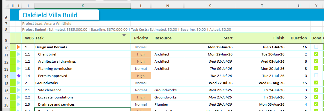
| Rows | On the left-hand grid | Over the timeline |
|---|---|---|
| 1–5 | Hidden. Internal bookkeeping — column identities, the link between this chart and its settings and resources sheets. Nothing here is for you to read or edit. | |
| 6 | The project name, sitting on a white card in the project colour at 18pt. Click the card to open Edit Project, the same form as Gantt Excel → Gantt Charts → Edit Project. | The date each timeline column stands for, stored as a plain serial number. You will not see it: the font is set to the same colour as the band behind it, so the row reads as solid project colour. |
| 7 | The project lead, set on the same form. | Three label rows, read top to bottom as widest unit to narrowest. Row 9 is the primary one, sitting directly against the grid; rows 7 and 8 give it context and are left blank in views that do not need them. On a daily chart that is the ISO week number on row 7, the weekday letter on row 8 and the date number on row 9. |
| 8 | The budget line — estimated and baseline budget, then the totalled task costs. It only appears when costs are switched on in Settings. | |
| 9 | The column headers. | |
| 10 onwards | One row per task. This is the only part of the sheet you type into directly. | The bars. |
| The last row | A greyed, italic prompt reading Type here to add a new task. Type a name over it and it becomes a real task, with a fresh prompt row appearing underneath. | |
The header text in row 9 is translated with the rest of the product, so on a French project the Duration column is headed Durée.
05 The columns you get
A brand-new chart shows nine columns to the left of the timeline. That is deliberately a small set: enough to build a plan, not so many that the timeline is squeezed off screen.
| Column | What it holds |
|---|---|
| WBS | The outline number (1, 1.1, 1.2, 2), generated for you from how the tasks are indented. Never typed by hand. |
| Task | The task name. Its indent is the outline level, which is why you indent with Make Child rather than the Tab key. |
| Priority | High, Normal or Low. A label, not a scheduling instruction. |
| Resource | Who is doing the work. Assigning someone makes the task follow that person’s working calendar. |
| Start | The estimated start date — your live plan. |
| Finish | The estimated finish date. |
| Duration | How long the task takes, in days on a daily chart or hours on an hourly one. |
| Done | A tick that jumps the task to 100% complete. |
| % Complete | Progress, drawn as shading on the bar. |
Fill in any two of Start, Finish and Duration and the third is calculated. On the Oakfield Villa Build chart above, “Architectural drawings” runs 6 days from Wed 01-Jul-26 and finishes on Wed 08-Jul-26, because Saturday 4 and Sunday 5 July are not working days. The Task Form explains that interlock in full.
The columns waiting in the wings
Another twenty-four named columns exist on every chart but start out hidden, and behind those sit twenty more you can name yourself. Switch on the ones a project needs and leave the rest alone:
- Status — Not Started, In Progress or Completed. It is worked out from % Complete rather than typed: 0% is Not Started, 100% is Completed, anything in between is In Progress. The three ribbon filters read % Complete directly too, so hiding this column does not affect them and showing it does not switch them on.
- Baseline Start, Baseline End, Baseline Duration and Actual Start, Actual End, Actual Duration — the two extra date bands. See Baselines & actuals.
- Baseline Cost, Est. Cost, Actual Cost, Resource Cost and Work — the money and work columns, covered in Work, costs & budget.
- WBS Predecessors and WBS Successors — what this task waits on, and what waits on it. See Linking tasks with dependencies.
- Late Start, Late Finish, Total Float, Free Slack and Critical — five read-only columns filled in by the scheduler. See The Critical Path & float.
- Notes — free text against the task.
- Bar Color, % Color, Baseline Color and Actual Color — per-task bar colours, also settable from the Task Form.
- Custom 1 to Custom 20 — twenty empty columns that are entirely yours. Rename the header to whatever you need (Supplier, PO number, Room) and the name sticks. They are the intended way to add your own data to a chart.
06 Showing, hiding and reordering columns
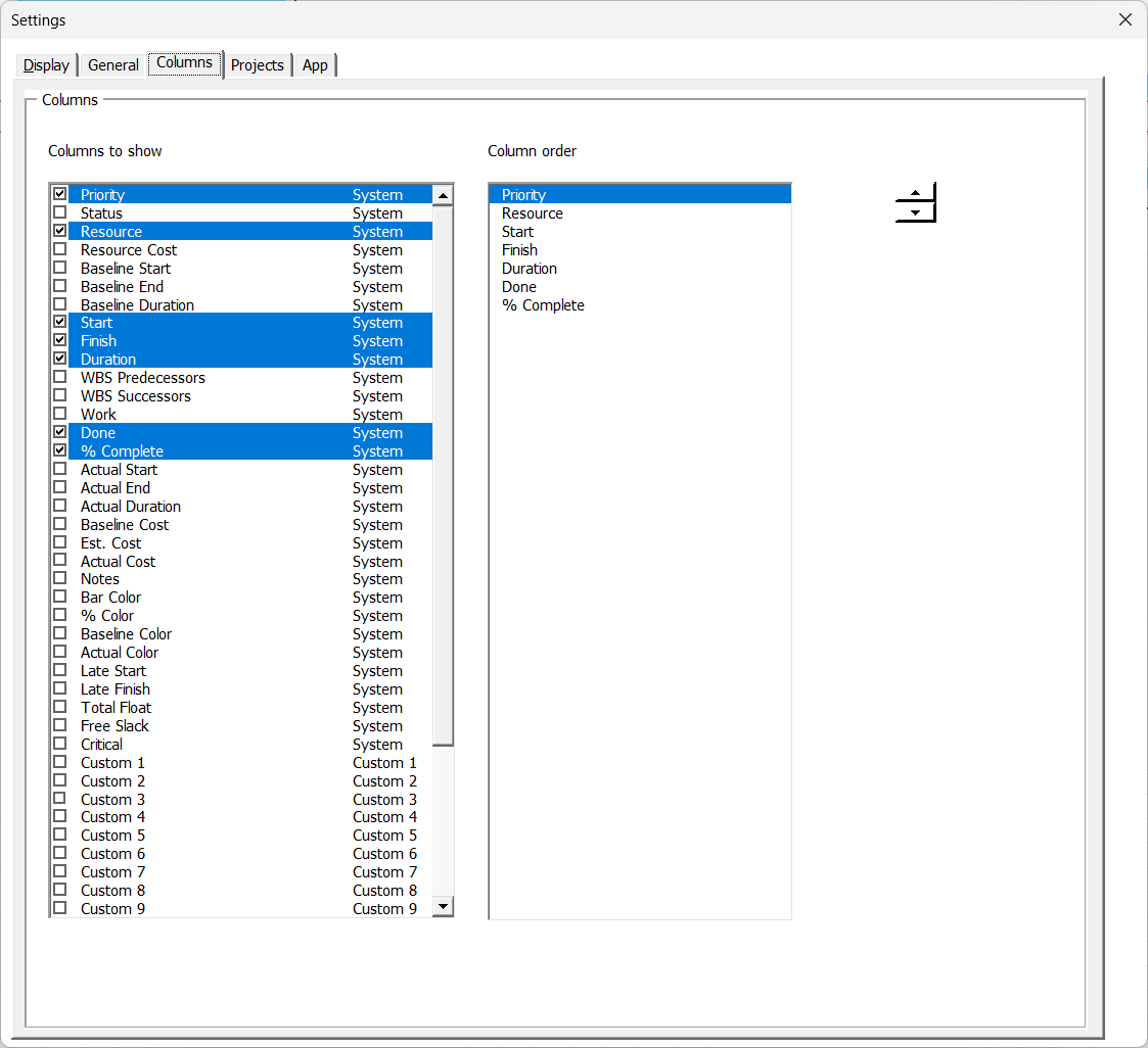
Column visibility is set in Gantt Excel → Settings → Settings, on the columns list, not by hiding columns in Excel.

Open Settings from the ribbon. The columns list shows every column you are allowed to control, with a tick against the ones currently on screen.
Tick to show, untick to hide. The sheet updates as you go, so you can see the grid getting wider or narrower behind the form.
Use the second list to reorder the visible columns. Select one, then use the small up/down spinner beside the list: up moves that column one place left on the chart, down moves it one place right.
WBS and Task are not in the list. They are the backbone of the outline, so they are always shown and cannot be hidden or moved.
Column widths are separate. Gantt Excel → Rows and Columns gives you Row Height for all task rows at once, Column Width for the selected column, and Auto Col Width to size a column to its contents.
07 The right-click menu
Right-click any cell on a Gantt chart and the usual Excel menu gains ten Gantt Excel commands at the top, above a dividing line.
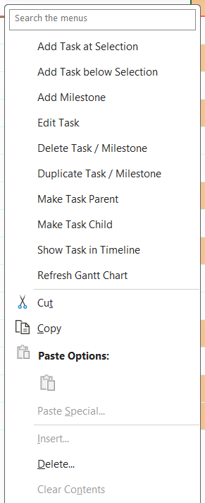
| Menu item | What it does |
|---|---|
| Add Task at Selection | Inserts a new task on the row you clicked, pushing the rest down. |
| Add Task below Selection | Inserts a new task on the row underneath. |
| Add Milestone | Adds a zero-duration marker instead of a task. See Milestones. |
| Edit Task | Opens the Task Form on this row — the same as double-clicking it. |
| Delete Task / Milestone | Removes the selected rows. Deleting a parent takes its children with it. |
| Duplicate Task / Milestone | Copies the task, dates and all, onto a new row. |
| Make Task Parent | Outdents the task one level, turning it into a summary row. |
| Make Task Child | Indents the task one level, tucking it under the task above. |
| Show Task in Timeline | Scrolls the timeline sideways until this task’s bar is on screen. |
| Refresh Gantt Chart | Redraws the chart. Rarely needed, but harmless. |
On a long project, Show Task in Timeline saves scrolling sideways through a year of columns to find one bar.
Excel’s own Insert, Delete, Clear Contents, Filter and Sort entries are greyed out on a Gantt sheet, and so are Insert and Delete on the row-number and column-letter menus. The reason is the same one behind the block on manual row inserts: a row added by Excel carries none of the bookkeeping that makes a row a task.
With a task filter switched on, the ten items are replaced by a single greyed-out line reading Gantt options unavailable – the task list is filtered
. A block of commands that silently vanished would read as a fault; one greyed line says why it has gone. Tick all three filters back on in Gantt Excel → Filters and the menu returns.
08 Common questions
The Gantt Excel tab has disappeared. Where has it gone?
Automation Off – Enable Macros to Continue. Click Here for Help.means no code is running. Click Enable Content on Excel’s yellow security bar and it clears itself. Enabling macros in Excel covers the rest: both platforms, files blocked because they arrived by email, and a tab that is present but does nothing. If the tab is there and every button is simply grey, you are on a worksheet that is not a chart; click a chart tab at the bottom of the window.
Why can’t I add or delete a task right now?
Where is Show Critical Path?
I right-clicked and there are no Gantt Excel commands. Why not?
Can I add my own columns to a chart?
Why is the Hourly View button missing?
Related: Creating your first chart · Adding, editing & deleting tasks · Settings · Views, timeline & zoom