
Settings
Settings is the control panel for one Gantt chart — what the timeline shades, which bars are drawn, how dates and costs are calculated, which columns you see, and the projects in the workbook. This page walks the whole dialog, group by group.
This is a reference page rather than a walkthrough. Work down it if you are exploring, or jump to the group you need from the list on the right. Two things are worth knowing before you open the dialog at all: settings belong to the chart, not to the file, and some of them apply the instant you click while others wait for the Apply button. Both catch people out, so they come first.
01 Where your settings live
Open Settings from the ribbon: Gantt Excel → Settings → Settings. Two things have to be true before the button does anything: the workbook must be activated, and the sheet you are on must be a Gantt chart. From the Dashboard, from a plain worksheet, or in a file where no licence has been entered, nothing opens.
That is the single commonest misunderstanding about this dialog. If you set a currency symbol, added a colour theme and hid six columns, then created a second chart and found none of it there, nothing has gone wrong — the new chart started from the template defaults. Duplicate on the Projects tab is the way to carry a chart’s settings across, because it copies the settings sheet along with the data.
Three things are deliberately not per chart, because they are about the application rather than about a project: the Form Font Size used by every dialog, the App Language that the Dashboard and new charts start in, and the Web Report Template. They live on the App tab and are covered in section 13.
The dialog has five tabs: Display, General, Columns, Projects and App.
02 What applies at once, and what waits for Apply
There is no single OK button. Most of the dialog acts the moment you click, and one tab batches its changes behind Apply.
| Where | When it takes effect |
|---|---|
| Display tab | Immediately. Every tickbox writes the setting and redraws the affected part of the chart while the dialog is still open. |
| General tab | On Apply. Until then your clicks only mark the setting as changed — nothing is written and nothing is recalculated. |
| Columns tab | Immediately. A tick hides or shows the column there and then; the spin button moves it as you press. |
| Projects tab | Immediately. Anything that deletes asks you to confirm first, sometimes twice. |
| App tab | Immediately, each with its own button. |
So on the General tab you can change the date format, the currency, the percentage mode and the calendar years, then press Apply once and let Gantt Excel reformat, recalculate and redraw in a single pass. That is the point of batching it: switching percentage mode alone re-derives the progress of every task in the project, and you do not want that running four times over while you are still deciding.
Two settings sit half in each camp. Auto-calculate Baseline Dates and Auto-calculate Actual Dates ask you to confirm and store your answer straight away, but the recalculation of those dates — and the redraw of the bars — still waits for Apply.
03 Why a setting is greyed out
Controls in this dialog are disabled rather than hidden, so you can always see what a feature would offer. These are the reasons you are most likely to meet.
1 — The chart is in Hourly View. An hourly chart draws only its base bar, its working-hour segments and its percentage bar, so anything that paints behind or beside those has nothing to do. While the view is hourly, these are disabled:
- Show Baseline Bars and Show Actual Bars — an hourly chart draws neither. Their colour swatches are hidden and the Base Bar (Hourly View) swatch appears in their place.
- Highlight Holidays per Resource and Highlight Work Off Days per Resource — the per-row shading is not drawn in this view.
- Timeline Column Color 1 and Timeline Column Color 2 — the alternating column stripes are not drawn either.
- Hide Holidays and Hide Work Off Days — an hourly timeline is built in hours, so whole-day columns are not there to collapse.
Your stored choices are left alone while they are disabled, so switching the chart back to a day-based view brings them back exactly as you left them. Note that the organisation-wide Highlight Holidays and Highlight Work Off Days do work on an hourly chart and stay enabled. More on the two kinds of chart in Planning by the hour.
2 — The timeline is switched off. With Show Timeline or Refresh Timeline turned off from the ribbon, there is no drawn timeline to colour, so the bar colours are disabled and a notice above them reads Enable Show Timeline and Refresh Timeline under Gantt Excel > Views and Timeline.
Ticking Show Text on Bars in that state is refused with Please enable Show Timeline and Refresh Timeline under Gantt Excel > Views and Timeline before using bar text features.
3 — The colour needs its feature turned on first. A colour swatch for something that is not being drawn refuses politely rather than storing a colour nobody will ever see: clicking the baseline bar colour with the bars switched off gives you Please enable Show Baseline Bars.
, and the same pattern applies to the today line, the dependency lines, the percentage bars, the critical path and the highlighted days.
04 Display — the timeline
The timeline settings on the Display tab control what is painted behind your bars: non-working days, stripes, and the header rows above the grid. Which days count as holidays or work-off days comes from the calendars in Resources — these settings only decide how they are shown.
- Highlight Holidays and Highlight Work Off Days — shade those columns in the timeline, each with its own colour swatch beside it.
- Hide Holidays and Hide Work Off Days — collapse those columns instead, so a 3-week job with two bank holidays in it fits in less width.
- Highlight Holidays per Resource and Highlight Work Off Days per Resource — shade each task row against the calendar of the resource assigned to it, rather than the organisation’s. Useful when people work different weeks.
- Timeline Vertical Border — the vertical grid lines through the timeline, with a colour of their own. The border colour asks you to tick the box first:
Please enable Timeline Vertical Border.
- Timeline Column Color 1 and Timeline Column Color 2 — alternating stripes down the timeline columns. They are one setting with two colours, so ticking either box ticks both.
- Timeline Top Row A, Timeline Top Row B, Timeline Middle Row and Timeline Bottom Row — the colours of the three header tiers above the grid. There are four swatches because the top tier alternates between its A and B colours.
Those header rows are named by position rather than by content on purpose. What each tier shows changes with the view: on a daily chart the tiers are the week, the weekday letter and the date number; on an hourly one they are the day, the hour and AM/PM. A name like “week row” would be wrong in every view but one. The top tier has two colours because it alternates.
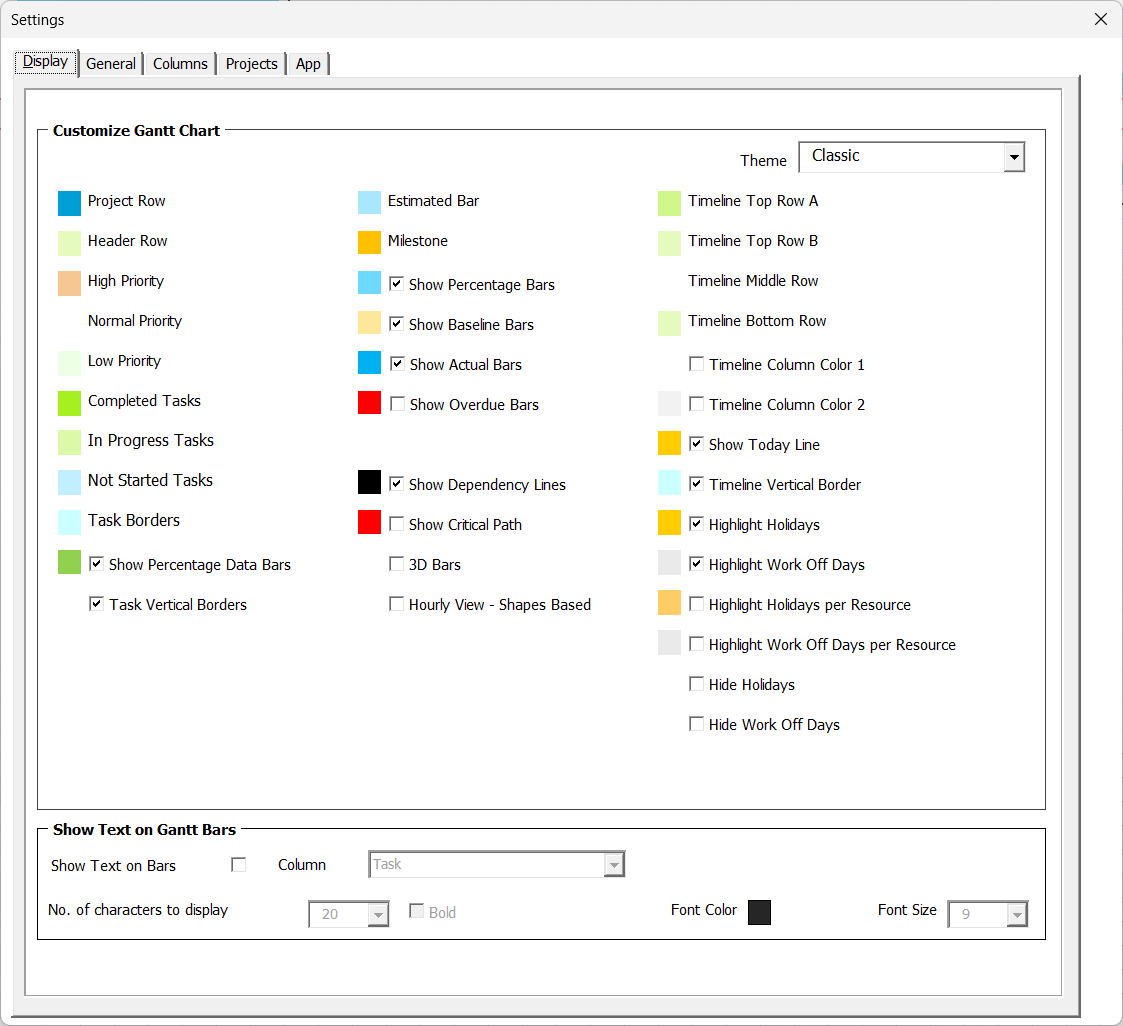
- Five tabs. Display, General, Columns, Projects and App — this is the Display tab.
- Timeline. Shading, hiding and stripes for holidays and work-off days.
- Customize Gantt Chart. Which bars, lines and markers get drawn.
- Show Text on Gantt Bars. Prints a column’s value on each bar.
- Theme. Five stored palettes; only Custom can be edited.
- Colour swatches. Click one to pick a new colour for that part of the chart.
- Greyed out. Hourly view, or the feature it colours is switched off.
05 Display — the Gantt bars
The Customize Gantt Chart group decides what is drawn on the chart itself. Every box here acts immediately, so you can tick, look at the chart behind the dialog, and untick again.
- Show Baseline Bars and Show Actual Bars — the second and third bar on each row. Turning one off deletes those bars; turning it back on redraws them. See Baselines & actuals.
- Show Overdue Bars — repaints a bar in the overdue colour once it is past due, and tints the matching status cell to match.
- Show Percentage Bars — the completed part of each bar, shaded in the percentage colour. See Understanding % Complete.
- Show Percentage Data Bars — the small in-cell bars in the % Complete column itself, which are a separate thing from the shading on the Gantt bar.
- 3D Bars — a raised bevel on the estimated bars and milestones. Baseline and actual bars are left flat: they are thin strips, and a bevel on them reads as clutter rather than depth.
- Show Today Line — the vertical marker on today’s date, with its own colour.
- Show Dependency Lines — the connectors between linked tasks. See Linking tasks with dependencies.
- Show Critical Path — highlights the chain of tasks that decides your finish date, and fills the five critical-path columns.
- Task Vertical Borders — the vertical grid lines through the task columns on the left.
- Hourly View – Shapes Based — how hourly bars are drawn.
Hourly View – Shapes Based is worth a sentence of its own. Unticked (the default), hourly bars are drawn by filling whole hour cells, which is fast. Ticked, each bar is drawn as a shape placed at its exact start and end time, which is what you want for sub-hour planning at a 15-minute increment. Switching either way clears the old drawing and rebuilds the whole chart, so if you are looking at an hourly view when you change it, Gantt Excel warns you first: Changing the hourly bar style redraws the whole Gantt chart. This may take a few seconds.
Change it from any other view and there is no warning, because nothing on screen has to be rebuilt — the setting is simply stored and takes effect when you next switch to the hourly view.
06 Display — text on the bars
Tick Show Text on Bars and every bar gets a caption taken from one of your columns. The five controls under it come alive once it is ticked:
- Column Name — which column supplies the text. It defaults to Task, but a resource name, a status or one of your own Custom columns is often more useful, since the task name is already in the row beside it.
- No. of characters to display — 1 to 50. Long names are trimmed to fit rather than overflowing the bar.
- Bold and Font Size (1 to 25) — how the caption is set.
- Font Color — the colour of the caption.
Changing the column or the character count rebuilds the text on every bar, because the text itself changes. Changing the size, the bold or the colour is a lighter touch and only restyles what is already there — which is why it feels instant on a big chart and the other two take a moment.
07 Display — theme and colours
The Theme dropdown holds five stored palettes: Blue, Classic, Excel, Dark and Custom. Picking one repaints the whole chart — bars, borders, timeline header, priority and status colours — in that palette’s colours.
There are 32 swatches in all. Clicking one opens the colour picker; choosing a colour applies it to the chart straight away, and Cancel in the picker leaves everything exactly as it was.
Bar and marker colours
Grid, rows and timeline colours
Day-shading colours
Priority and status colours
Themes, the palette rows behind them and how a colour choice travels with a chart are covered properly in Colours & themes.
08 General — dates
Everything from here to section 10 sits on the General tab, so nothing in these three sections happens until you press Apply.
The Dates group holds:
- Auto-calculate Baseline Dates and Auto-calculate Actual Dates — whether those two bands behave like the Estimated band, keeping start, end and duration in step.
- Total of Subtask Durations or Earliest Start to Latest End — how a summary task’s duration is worked out. See Summary tasks, indenting & the WBS.
- Italicize Dependency-Driven Dates — italicises a date that a predecessor is driving, so you can see at a glance which dates are yours to type and which the schedule owns.
- Date Format — 29 formats to choose from.
- Start Year and End Year — the calendar range.
The two auto-calculate boxes confirm before they change anything, because switching one on tidies the columns it takes over. Turning on baseline auto-calculation warns: Enabling automatic calculation of Baseline Dates will remove any non-date (text) values from the Baseline Start and Baseline End Date columns. If both start and end dates exist, duration will be recalculated automatically. Any orphaned end-date or duration values that no longer match will also be cleared. Do you want to proceed?
Answer No or Cancel and the tickbox springs back.
Worked example — the date format
Say your kitchen refit runs Mon 6 July to Fri 10 July, 5 working days on a Monday-to-Friday week. With the format DD/MM/YYYY those dates read 06/07/2026 and 10/07/2026. Switch to DDD DD/MM/YY and press Apply, and every date column in the project is rewritten as “Mon 06/07/26” — which makes weekend spill obvious at a glance without counting. The format changes how dates are displayed; it never changes the dates themselves.
09 General — percentage complete
Two either/or choices, both applied by Apply:
“Who decides how far along a task is?”
Automatic derives each task’s percentage from its schedule. Manual leaves the number entirely to you, and nothing overwrites what you type.
Manual is the honest choice for real projects: elapsed time is not progress. Automatic is useful for a plan you are demonstrating rather than running.
“How does a summary task roll its children up?”
Simple averages the child percentages evenly. Weighted weights each child by its size, so a 20-day task counts for more than a 1-day one.
Weighted is nearly always the truer figure. Simple is only right when every child is about the same size.
Changing either one recalculates the percentages across the project, rolls the summary tasks up again and redraws the bars, which is exactly why it waits for Apply. Both modes, and what they do to a part-finished plan, are covered in Understanding % Complete.
10 General — costs and currency
The Costs group has three settings:
- Enable Costs — switches the costing side of the product on. Applying it with the box ticked recalculates the project budget line at the top of the chart; applying it unticked clears that line.
- Calculate Resource Cost — prices each task from the rates of the resources assigned to it, instead of leaving the resource cost to you.
- Currency Symbol — the symbol used by every money column.
Turning Calculate Resource Cost on asks you to confirm, and the warning is worth reading rather than clicking past. It arrives as two lines — This will erase all current resource cost values.
followed by Do you want to proceed?
— and the default answer is No. Any figures you typed by hand are replaced by calculated ones. How the calculation works is in Work, costs & budget.
Currency Symbol is a dropdown you can also type into. The list offers 22 common currencies, each shown with its ISO code beside it — GBP, EUR, INR, ZAR and so on — so you can still find your row when the font has no glyph for the symbol itself. If your currency is not listed, type the symbol straight into the box. Two limits: no double quotation mark, and ten characters at most, which is generous next to the longest real symbols.
11 The Columns tab
Two lists, one job each, and both act immediately.
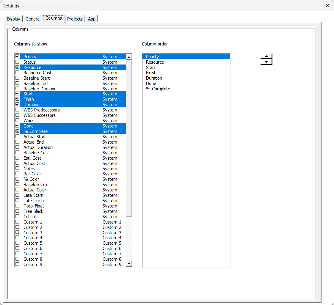
Columns to show lists every column in the task area with a tick box. Ticked means shown. Untick one and it is hidden from the chart as you click; tick it again and it comes back.
Column order lists only the columns that are currently shown, left to right as they appear on the chart. Select one and use the spin button to move it a place left or right.
Splitting them was deliberate: one highlighted row cannot sensibly mean both “the column I am about to hide” and “the column I am about to move”. Hidden columns are simply not in the order list, and a move steps over them, so what you move matches what you are looking at.
A cost column that has never been shown comes back at a sensible width rather than as a hairline you cannot see. If a move cannot be made — most often because the sheet is protected — Gantt Excel says so with The column could not be moved. The sheet may be protected.
and leaves the chart untouched.
12 The Projects tab
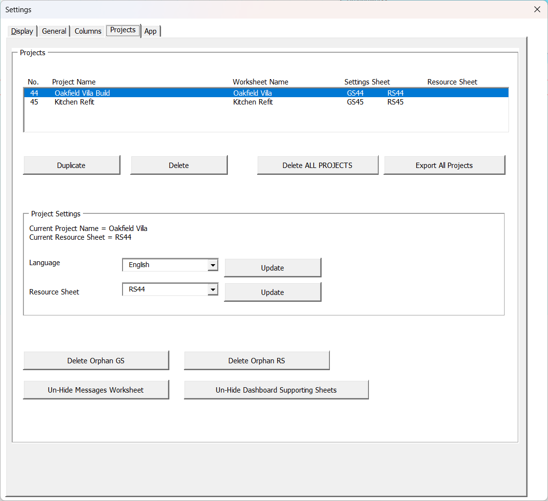
This tab is about the workbook rather than the chart. The list shows one row per Gantt chart in the file, with its number, its project name, its worksheet name and the names of its settings and resource sheets. It opens with the chart you came from already selected.
- Duplicate — copies the selected project: its data, its settings sheet and its resource sheet, as a new project with a new number, and “Copy” plus that number added to its name. The copy keeps the original’s column widths and hidden columns, so it looks like the chart it came from — with one deliberate exception: the Priority column is set back to the app’s own width, because the tinted priority chip is sized to fit it.
- Delete — deletes the selected project after showing you exactly which three worksheets will go. If another chart is using the same resource sheet, that sheet is kept and you are told so.
- Delete ALL PROJECTS — clears every chart out of the workbook. It asks twice, and the second warning is
This action is irreversible. All projects will be permanently deleted. Do you want to proceed?
It also empties the Dashboard’s supporting data, so a cleared file keeps no trace of the projects you removed. The Dashboard rebuilds that data from your charts whenever you open it, so there is nothing to restore. - Export All Projects — writes every project out to a plain .xlsx with no macros: a snapshot for archiving or sending to someone who does not have Gantt Excel. It closes the dialog and warns you first:
This will take 30 seconds or less depending on the project data. Please DO NOT close this file until you see a confirmation message.
- Delete Orphan GS and Delete Orphan RS — housekeeping. They remove settings and resource sheets left behind by a chart that no longer exists.
- The Resource Sheet picker with its Update button points the current chart at a different resource sheet, confirming with the old and new names first. Because the calendars change, this recalculates every date, dependency and cost in the project and rebuilds the timeline.
13 Settings that belong to the whole workbook
The App tab is where the settings that are not per chart live: the language the Dashboard and new charts start in, the web report template, and the font size of the dialogs.
- Form Font Size — 8 to 15 points, applied to every dialog in Gantt Excel. It re-sizes the Settings window in front of you as soon as you pick, so you can judge the size on the form you are looking at, and it stays put as you move between the charts in the workbook. On a Mac every dialog is scaled up a little, so the same number reads slightly larger there than on Windows.
- Web Report Template — shows which template the HTML report is built from, with Load Template… to import your own and Reset to Default to go back to the built-in one. Reset is greyed out when the built-in template is already in use. See The Web Report.
- Remove License — takes the licence off this file. It confirms first, then saves and closes the workbook so you can reopen it and enter new details.
- Remove License and Delete ALL PROJECTS — the same, plus a full clear-out, leaving the file in the state a fresh build starts from. It differs from the first option in three ways worth knowing: it does not close the file, it does not save it either, and it leaves the licence type genuinely blank rather than re-stamping the file as unlicensed. The projects go first and the licence second, so if something stops it part-way you can be left with the charts gone and the licence still in place.
- The two Hide / Un-Hide buttons show or hide the Messages worksheet and the Dashboard’s supporting sheets. The button’s wording always says what it will do next, so you can tell the current state by reading it.
Two language pickers, two different jobs
This trips people up, so it is worth being precise. Both use a dropdown of the languages Gantt Excel ships with and an Update button beside it.
- The Language for this chart changes the chart you are on right now: its column headings, the ribbon labels and the messages you see. It confirms with
The language has been updated. Please close this Settings window to fully apply the new language.
- The App Language on the App tab sets the default for the Dashboard’s “All Projects” view and for charts you create later. It deliberately leaves the chart you are on alone, and says so:
The app language has been updated. It will apply to the dashboard and new projects the next time the dashboard is refreshed.
Changing one and expecting the other to follow is the usual mix-up. Working in another language covers both, and what travels with a chart sent to a colleague.

14 Common questions
I changed a setting and nothing happened. Why?
Why are my settings missing on my second chart?
Why can’t I change a colour?
Set the theme to CUSTOM to change this color.— switch the theme to Custom first. Or the thing that colour paints is switched off; a swatch will tell you which box to tick, for example
Please enable Show Percentage Bars.
Where is the Show Critical Path button on the ribbon?
Half the timeline options are greyed out on my hourly chart.
Can I hide the Task or WBS column?
Related: Colours & themes · The Critical Path & float · Understanding % Complete · The Gantt Excel tab & your chart sheet